
Why cosmetic labels need more than a pretty print
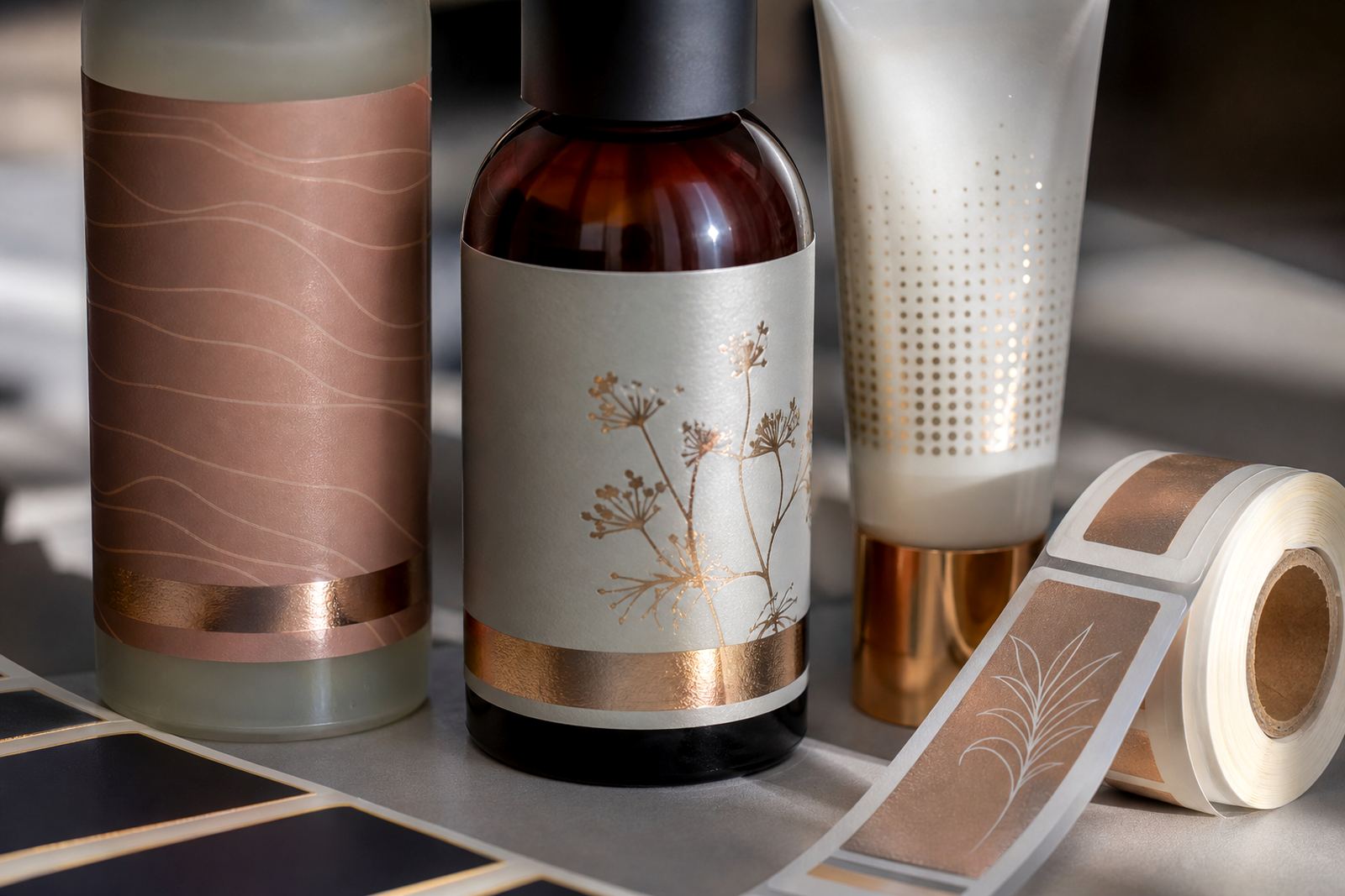
In beauty and personal care, the label often does the first selling. A face cream, hair treatment or body wash can stand out because the pack looks clean, polished and well made, even before the customer picks it up. That is why finish choices matter just as much as colour and layout.
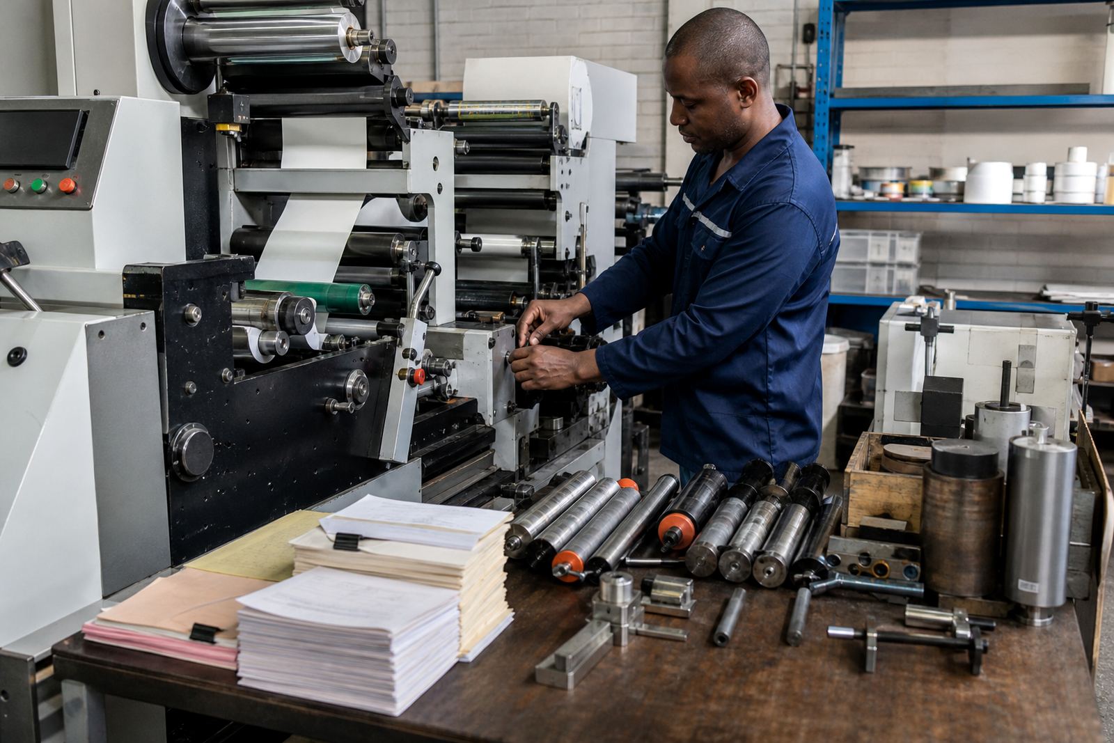
On narrow-web flexo label presses, the best results usually come from combining good artwork, correct plate mounting and the right finishing sequence. A label that looks sharp in the reel but rubs off in transit will cause trouble at dispatch and on the shelf. In humid areas like Durban or during hot Gauteng afternoons, the finish also has to cope with moisture, handling and storage changes without curling or losing clarity.
- Match the finish to the product use, not only the look you want.
- Check how the label behaves on curved bottles, tubes and jars.
- Allow for handling during packing, delivery and retail display.
Matte, gloss and soft-touch looks for beauty packs
Many cosmetic brands use a matte finish for a calm, modern feel, while gloss works well when a label needs more shine and stronger colour pop. Soft-touch effects can give a smoother hand feel on premium ranges, but the whole pack needs to be balanced so the finish does not fight with the colour palette or product name.
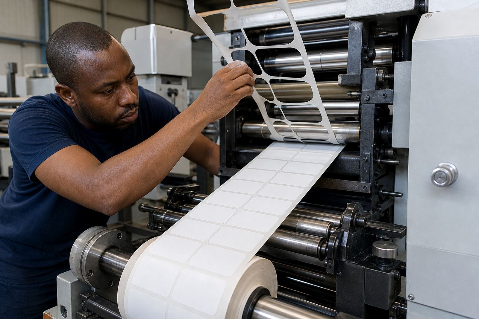
For label converters, the key is consistency. A slight change in ink density, web tension or drying can alter the final look. During setup, the press team should check that the print and finishing layers sit properly on the material, especially on small labels where every millimetre counts. In practice, a neat finish is often less about fancy extras and more about controlled production from the first label to the last.
- Use matte when the brief calls for a calm, clean and modern appearance.
- Use gloss when you need brighter colour and a more reflective surface.
- Use soft-touch only where the pack design and handling demands justify it.
Spot varnish and texture where it adds value
Spot varnish is useful when a cosmetic label needs one area to catch the eye, such as a logo, product name or small design detail. Texture can also help create a tactile point of difference, but it should be used with care. On small labels, too much effect can make the pack look busy or confuse the reading order.
On narrow-web flexo label presses, setup for spot effects needs close attention to registration, drying and material choice. If the print is not aligned properly, the result can look untidy, especially on curved containers. For beauty and personal care products, the aim is usually controlled contrast rather than showy decoration. That is often what gives a label a tidy, expensive feel without wasting material or slowing production.
- Keep textured effects to key areas that help the design, not the whole label.
- Use spot varnish to guide the eye to the most important product details.
- Test the label on the actual bottle or jar shape before approving the run.
Foil, metallic and high-contrast finishes that still print well
Metallic finishes can work well on cosmetic packaging when the product needs a premium edge. A light metallic touch may suit a skin care range, while darker contrasts can help a grooming or salon product feel stronger. The point is to use the effect with restraint, because too much shine can make fine text harder to read.
Good press setup is important here, especially where foil, varnish or metallic ink sits next to small type or fine line work. The press team also has to think about finishing setup, because what happens after printing can affect the final appearance. If the label is being applied in a busy packing line, or stored in a warm warehouse, the finish needs to hold together properly and still look neat when it reaches the customer.
Common checks before production include:
- Confirming the label stock works with the planned finish.
- Checking registration on small text and border work.
- Making sure drying or curing is suitable for the production pace.
- Reviewing how the finish will look under store lighting.
Durability matters in bathrooms, salons and distribution
Cosmetic labels are often exposed to moisture, soap, oils and frequent handling. A bathroom shelf, salon basin or retail back room can be harder on a label than many people expect. This is why finish selection should include practical use, not only shelf appeal. A label that looks good in a warm warehouse in Kempton Park must also stay intact after delivery to Cape Town or Gqeberha, where transport and storage conditions may differ.
Preventive maintenance on the press and proper anilox care help keep print quality steady, while plate mounting and setup support reduce the risk of waste. If the finishing line is not set correctly, labels may scuff, lift or lose edge sharpness during packing. For converters, these small problems can become costly quickly, especially when the product range uses many label sizes or short production runs.
- Choose finishes that tolerate humidity, oils and repeated handling.
- Keep the print and finish sequence consistent from start-up to the last carton.
- Check edge lift, scuffing and colour shift before full production.
A practical local example from Gauteng production floors
A common situation in the East Rand is a personal care packer who wants a neat, premium look for a cream jar and a matching body wash bottle. The brief may start with a simple matte base, a small gloss detail on the logo and a clean finish that does not overpower the pack. On press, the team needs to keep the web running steadily, make accurate adjustments, and confirm the label still peels and applies cleanly on the filling line.
That is where training and startup production support help. Operators need to understand how the finish behaves, how to check alignment and what to do when a label starts to look inconsistent. For many label converters, the real value is not only in the press itself but in the setup, the finishing choice and the support around daily production. A careful finish saves time later and gives the pack a more polished result from the first run.
Flexography Printer works with label converters across Johannesburg, Pretoria, Durban, Cape Town and Gqeberha from our base in Spartan, Kempton Park. We support press installation, commissioning, operator training, preventive maintenance, breakdown support and finishing setup, with practical help for cosmetic label production that has to look right and run well.