
Why shelf appeal starts with the label, not the carton
For many packaged goods, the label is the first thing a customer reads and the first thing they judge. A neat carton or bottle can still look tired if the label finish is dull, uneven, or mismatched from one batch to the next. In retail, that small detail can change how premium or reliable a product feels on the shelf.
In South Africa, this matters across food, cosmetics and household products where buyers compare packs side by side. A label that sits straight, carries clean colour and holds up well in transport tells a simple story: the maker pays attention. That kind of presentation is worth protecting, especially when products travel through hot stores, humid coastal depots, and busy distribution routes from Gauteng to the coast.
Finish choices that change how a pack is read
Different finishes create different signals. A gloss label can suggest freshness and strong colour, while a matte finish can read as restrained, clean or more upmarket. Clear labels, textured stock, varnish, foil effects and selective finishing all change how light moves across the pack. The aim is not to add decoration for its own sake but to match the finish to the product and the shelf position.
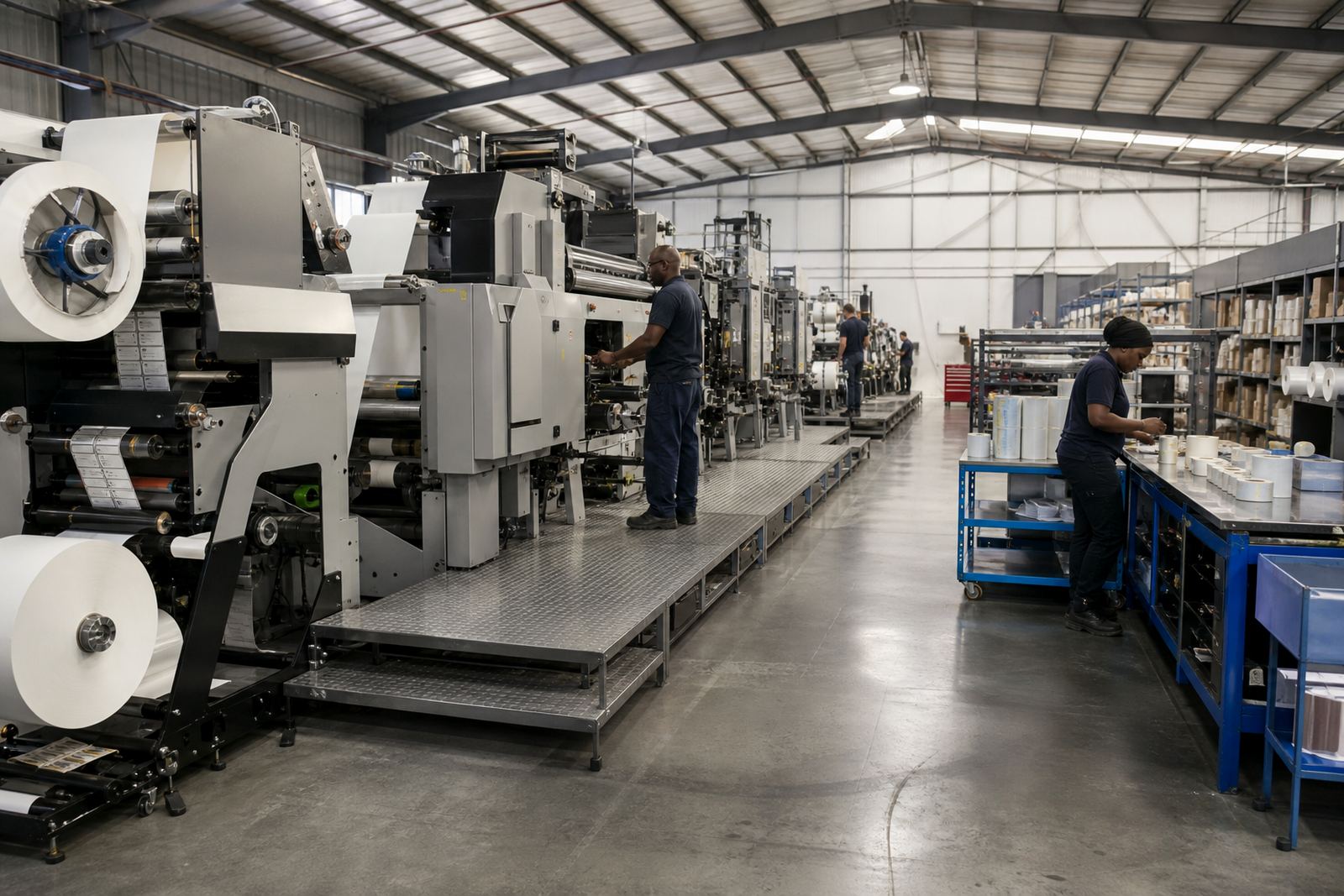
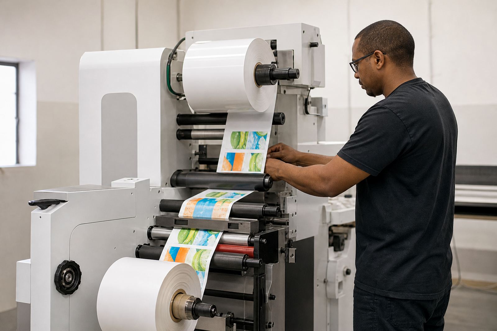
When a label converter works with narrow-web flexo label presses, finishing needs to be planned as part of the run, not left until the end. The print, die-cut, varnish and rewinding stages must all support the same result. If one step is inconsistent, the shelf effect is lost. Even a slight shift in registration or coating can make a pack look off-centre or uneven, and shoppers notice that fast.
- Gloss works well where strong colour and visual punch are important.
- Matte can suit natural, premium or minimal product ranges.
- Clear or no-label-look styles need careful handling to avoid visible flaws.
- Special finishes should still allow barcodes, ingredient text and batch details to stay readable.
Consistency batch after batch is what builds trust
One good sample does not win shelf space on its own. Retailers and brand owners need repeatable results across multiple print runs, different substrates and changing production shifts. If a label looks different every time, the brand starts to feel unstable even when the product inside is fine. Consistency is what turns a nice label into a dependable part of the pack.
That means paying attention to colour control, plate mounting, web tension, rewind quality and the condition of consumables. It also means making sure operators know what a correct label should look like before production starts. In practical terms, the best looking pack is often the one that runs cleanly from first reel to last reel, with no wasted labels and no surprises at dispatch.
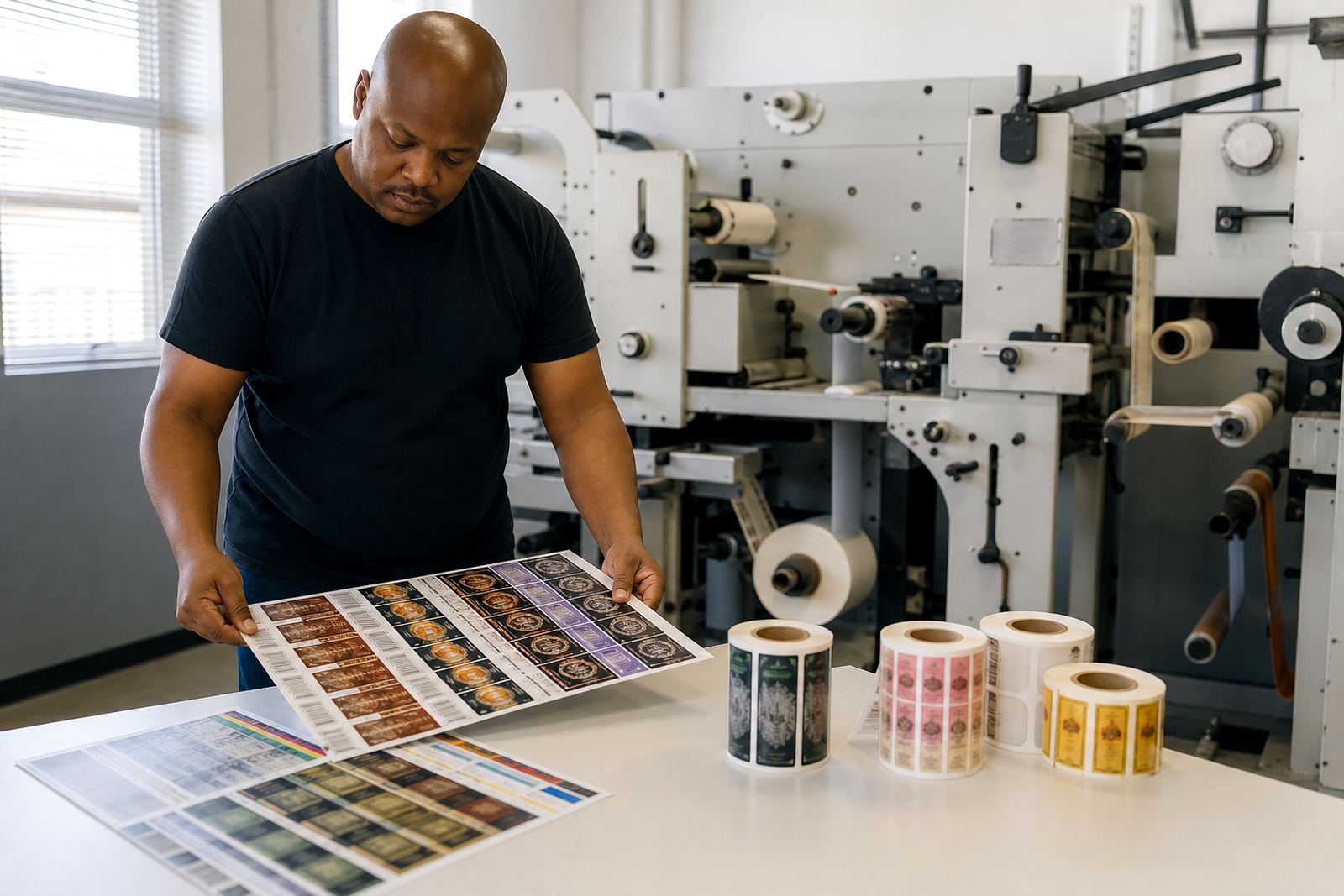
- Keep approved print samples close to the press for quick visual checks.
- Review registration and colour at the start of every job, then again during the run.
- Check that finishing elements stay aligned after die-cutting and slitting.
- Store labels correctly so heat and moisture do not affect the stock before application.
Local retail conditions can work against a good label
South African retail packs face real-world conditions that can punish weak label setup. A dairy bottle moved from a cool warehouse into a warm store, or a cosmetics pack sent through coastal humidity, can show curling, lifting or fading if the label stock and adhesive are not matched to the job. Load-shedding also creates its own pressure, because a press stoppage can disturb production flow and make setup discipline even more important.
For converters in Kempton Park and across Gauteng, the answer is to set up for the product’s actual route, not just its final shelf. That includes the carton room, transport time, storage temperature and the likely handling at the store level. A label that survives these conditions without lifting, scuffing or losing colour gives the retailer less to complain about and the brand more chance of repeat purchase.
What label converters should check before production starts
Before a run begins, the press team should confirm the finish requirements and the production limits of the job. That includes the order of print and finishing steps, the substrate choice, the drying or curing approach, and the way the roll will be handled after printing. A short setup review saves time later and cuts down on rejects. It also helps smaller teams avoid the common mistake of treating appearance and production as two separate issues.
A practical checklist keeps everyone aligned:
- Confirm the required look, including gloss, matte or clear presentation.
- Check that colour references are approved against the intended pack background.
- Inspect plates and mounting before the job starts.
- Make sure the finishing path will not damage fine text, barcodes or varnish details.
- Set aside a sample for sign-off before the full run continues.
Where label converters need extra hands, setup support and operator training make a measurable difference in day-to-day output. A clean first setup often means fewer interruptions, less waste and a better shelf result. It is basic work but it matters more than people admit.
A Kempton Park example from the retail side
A converter in the East Rand might be supplying labels for a range of products that all need a similar shelf feel, but not the same finish. A food jar may need a bright, clean look, while a personal care bottle needs a more refined surface with steady colour. If the press team changes finish or substrate without checking the effect under store lighting, the product line can look mismatched on the shelf. That is when a brand starts to feel less organised.
Working from Spartan in Kempton Park, our team supports label converters across Johannesburg, Pretoria, Durban, Cape Town and Gqeberha with press installation, commissioning, operator training, startup production support and breakdown support. For retail shelf presentation, the useful work is often behind the scenes: helping with finishing setup, plate mounting, anilox care and production consulting so the label looks right every time it reaches a pack. The better the setup, the less rework later and the cleaner the shelf result.
The practical value of a well-finished label
A well-finished label does more than look neat. It gives the product a clearer identity, helps shoppers trust what they see and supports the retailer’s standards on shelf. In a market where customers compare products quickly, presentation can be the difference between a pack that gets picked up and one that gets passed over. That is why finish and consistency deserve proper attention from the first press setup to the final rewind.
For label converters, the best approach is simple: choose the right finish, control the run carefully and train the team to spot problems early. When those basics are handled well, the label does its job properly. It supports the product, reflects the brand and keeps the shelf looking organised instead of mixed up.